The Project
As a platform for school districts HR needs, Frontline Education has a lot of data that can be very useful for district administrators. However, in the past it was very difficult for administrators to see any of the data in a useful way.
We had previously provided a way to see some key metrics on desktop, but we discovered a desire from users to have a mobile view of these metrics. I worked with a few product managers and the mobile development team to build these metrics into the mobile app.
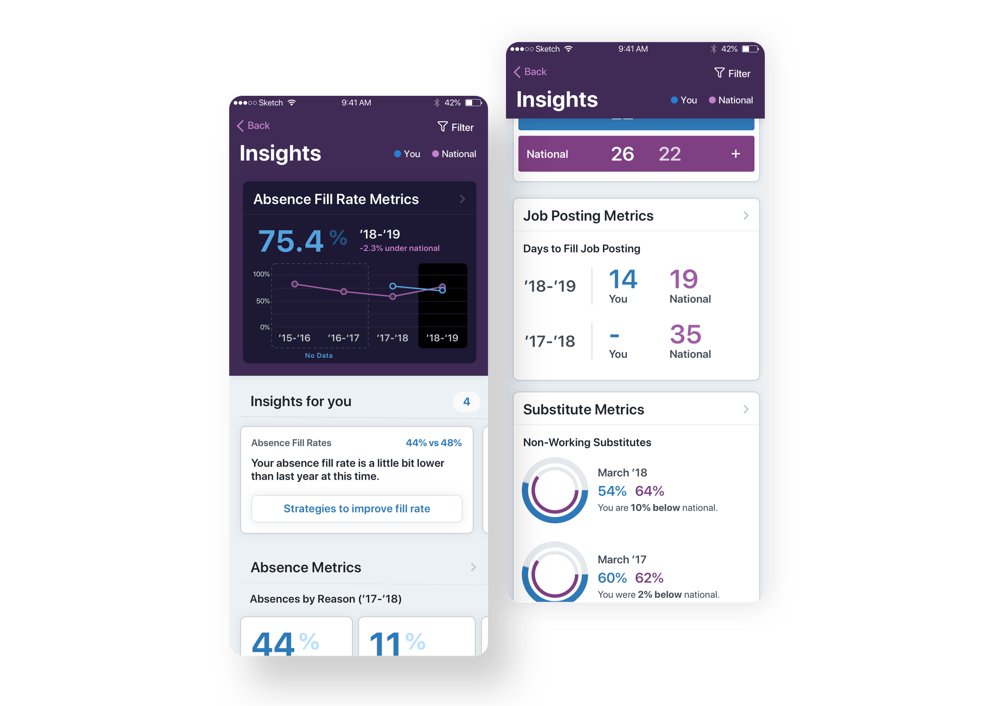
Discovery
Because this project had been tackled before on desktop (I had worked on that project as well), I had a good initial understanding of the needs we were serving. However, presenting these metrics on mobile presented some unique challenges:
- Metrics need to be quickly digestible on the go,
- Users must be able to see an overview statistic, but dive deeper if they would like,
- We need to give administrators advice about the metrics they are seeing.
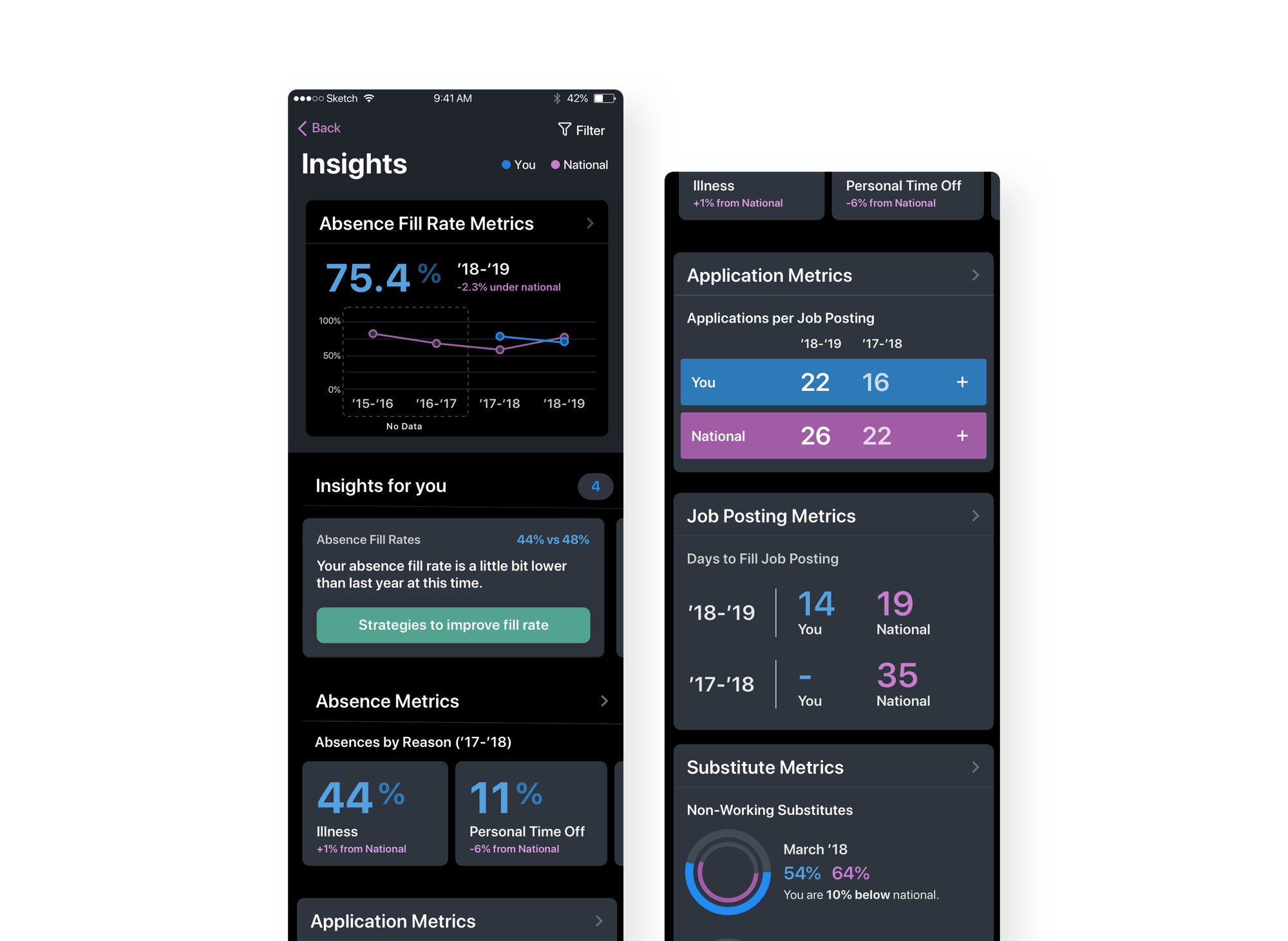
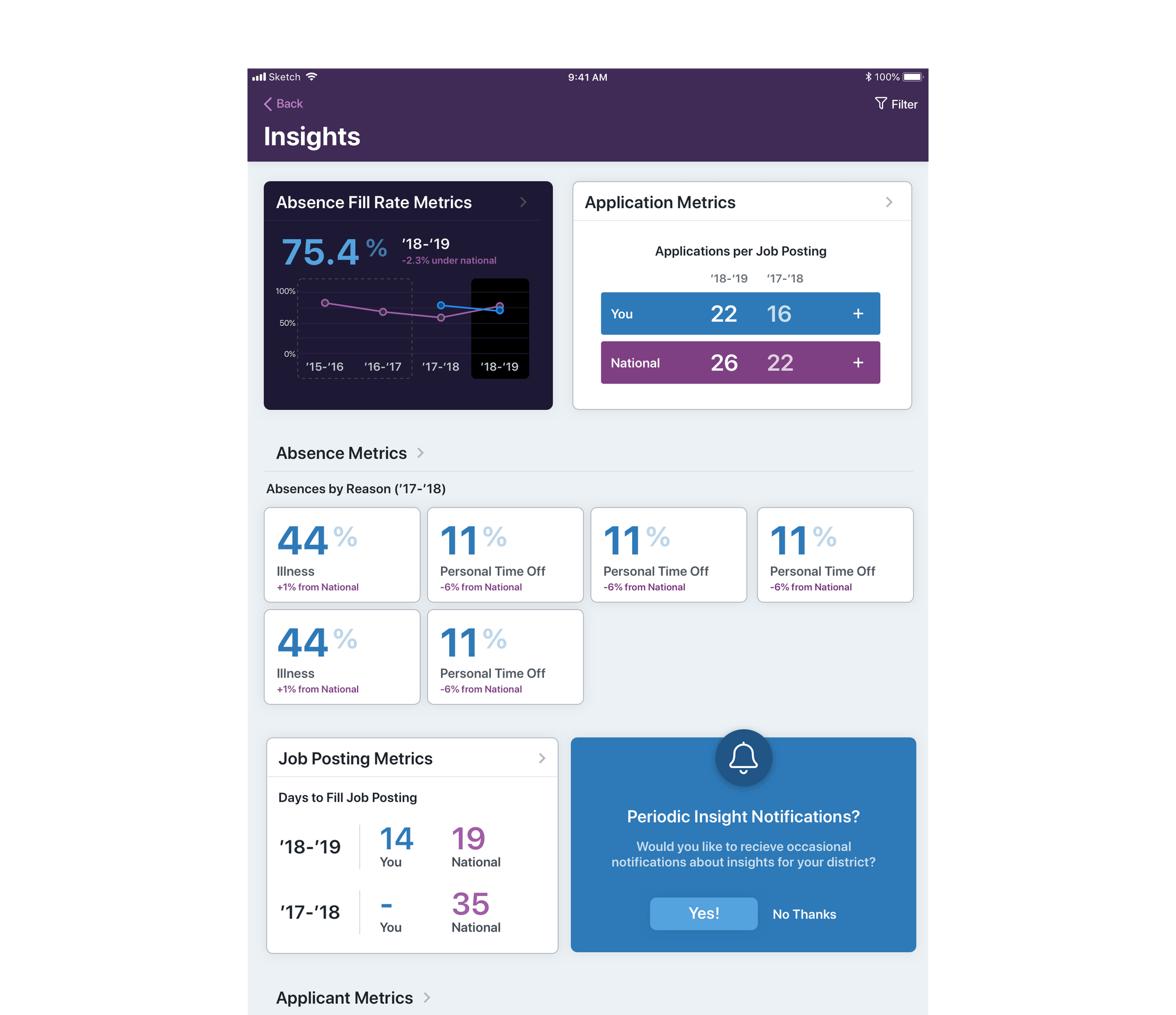
I partnered with our research team to get a better understanding of what our users expected when presented with these key metrics on mobile. We found that people reacted well to "progressive disclosure" techniques as well as simple visuals and charts. Users were adverse to data heavy screens and extensive filtering (at least at the first level)
Using wireframes, live design sessions, and some flowcharts, I worked with a product manager and dev team to refine the designs and make sure we had the data we needed to produce each screen.
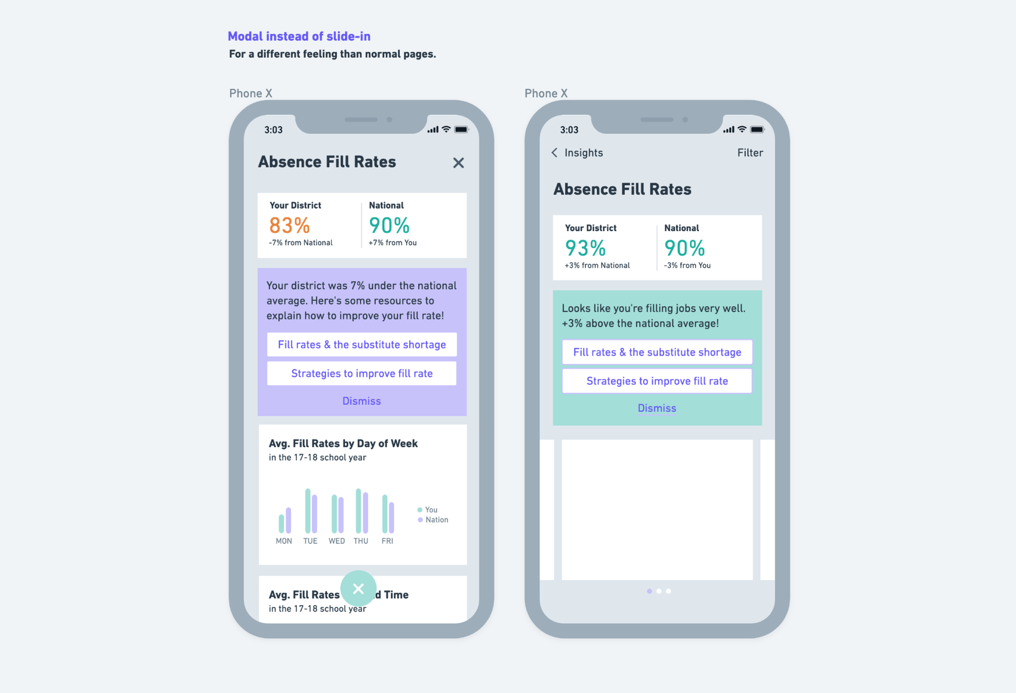

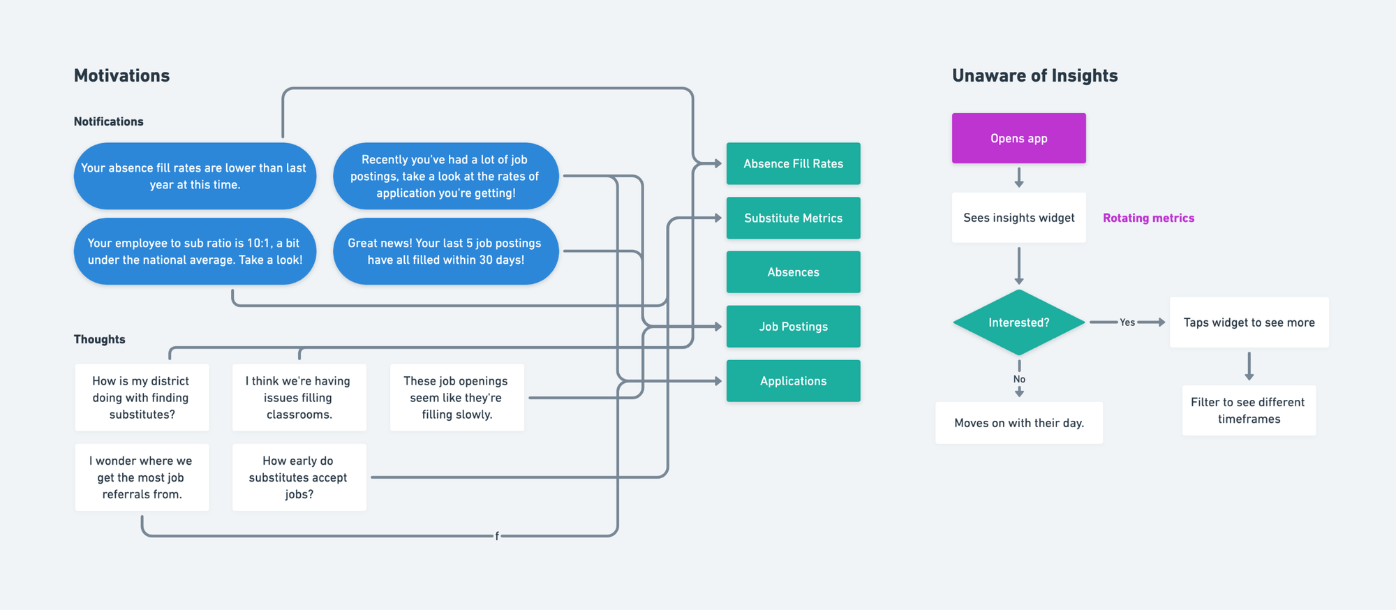
High Fidelity Designs
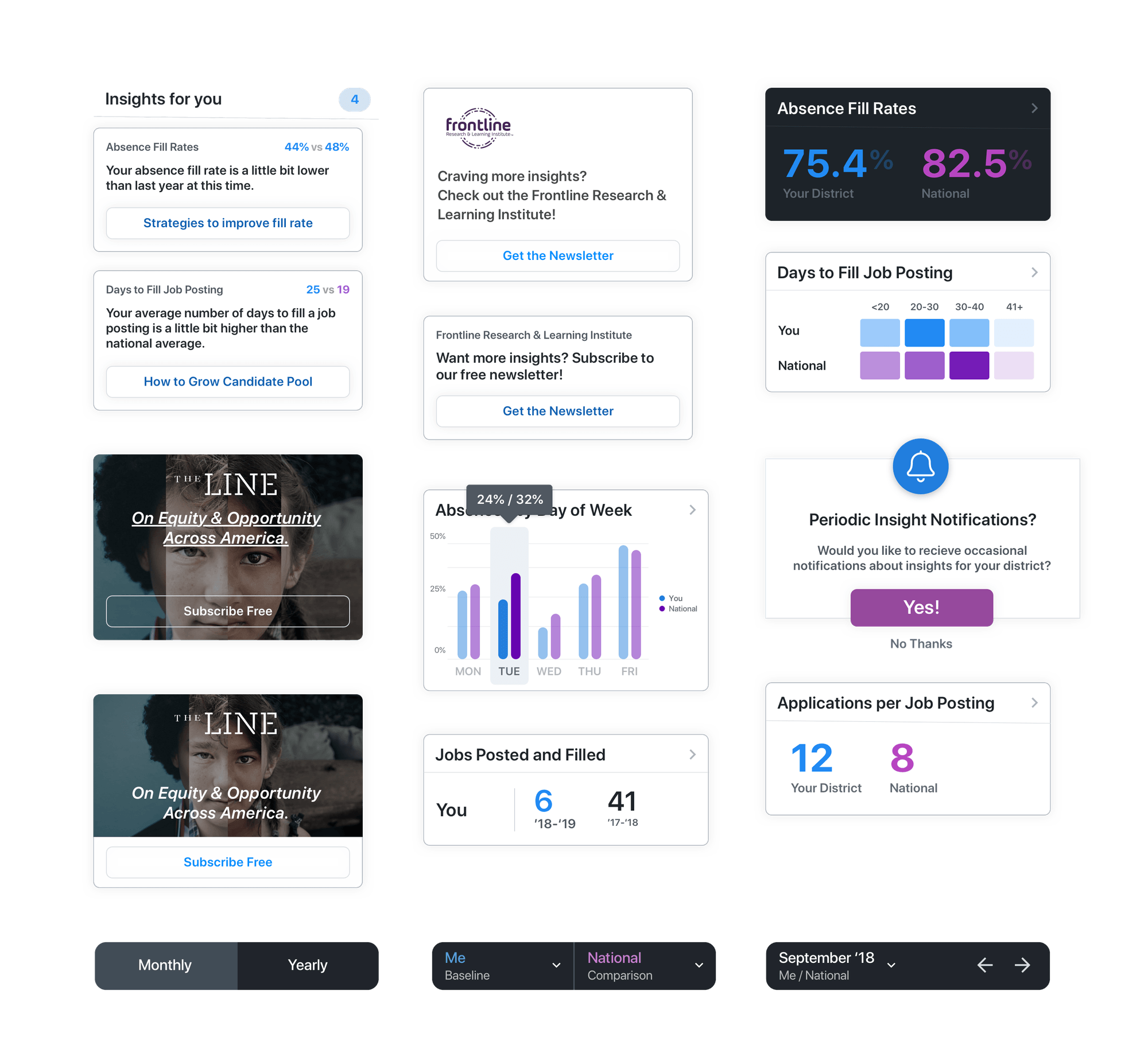
I designed a number of the base charts early in the process to allow the dev team to get a head start on building the custom charts. Keeping the charts readable and as simple as possible were my primary design goals.
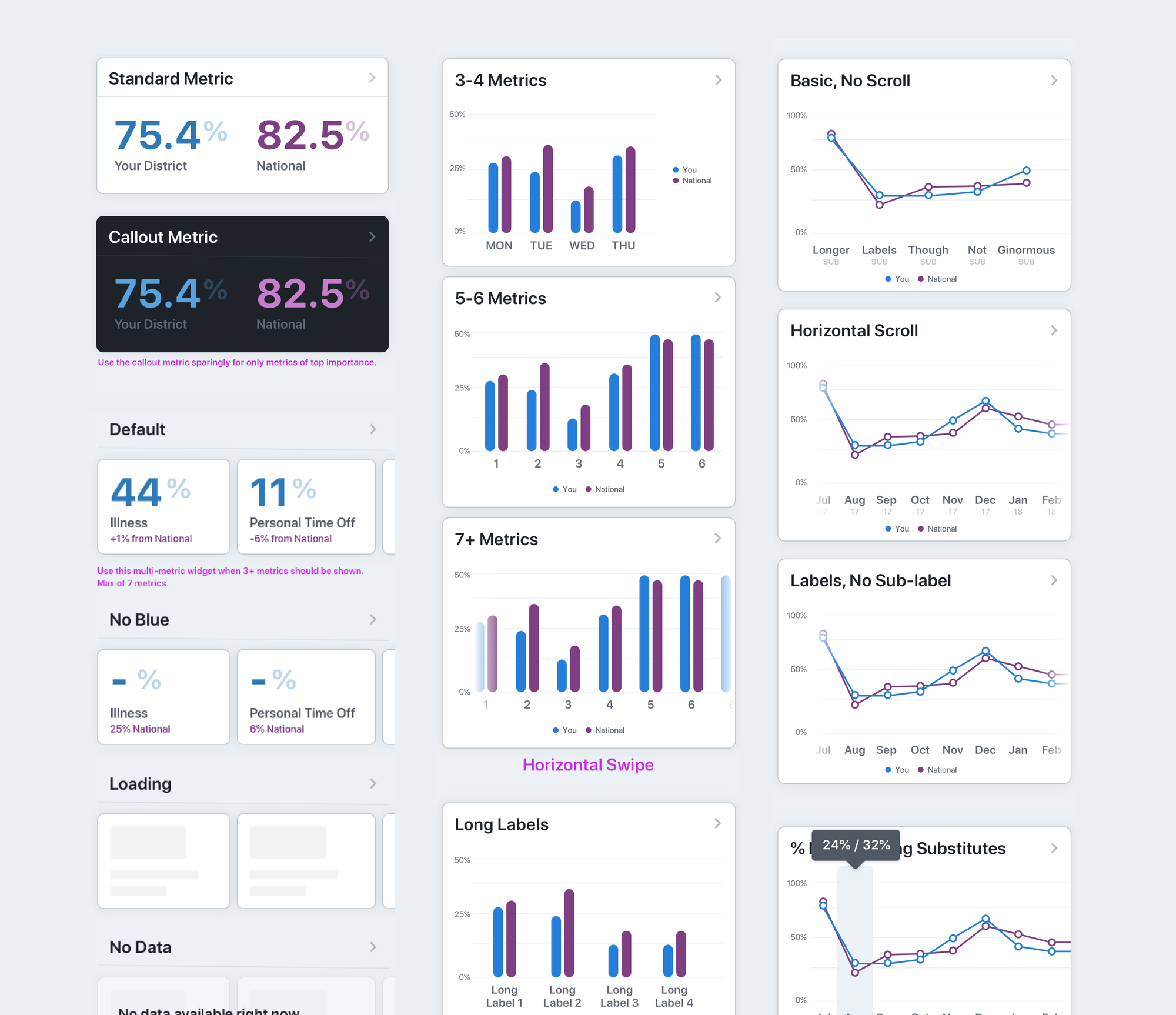
Communicating loading states, error states, empty states, and more to development was key to making the charts be most functional in all situations.
Additinally I was able to spend some time finessing the design for various current and future widgets for the app.
Outcomes
After a lot of hard work and patience, we were able to push a first version of this insights dashboard on mobile. We have had good response even though we weren't able to add all of the notification features we wanted. For the future, my recorded goals for improvement were adding notifications on insights to admins and making the charts even more interactive and insightful.