The Project
Frontline Education provides K-12 school districts with a full range of Human Capital Management and Employee Growth Solutions.
As Frontline has grown, the diversity of the solutions offered created a large variety of visual differences and workflow irregularities. A shared design language was important to minimize the amount of time spent designing common elements.
The Process
I worked with Jon Eckert to plan, design, and build the Lunchbox site from scratch.
Our existing styleguide was very minimal and wasn't accomplishing what we wanted it to. It wasn't easy to access, and it didn't cover all aspects of design at Frontline. We remedied this by prioritizing these 3 things:
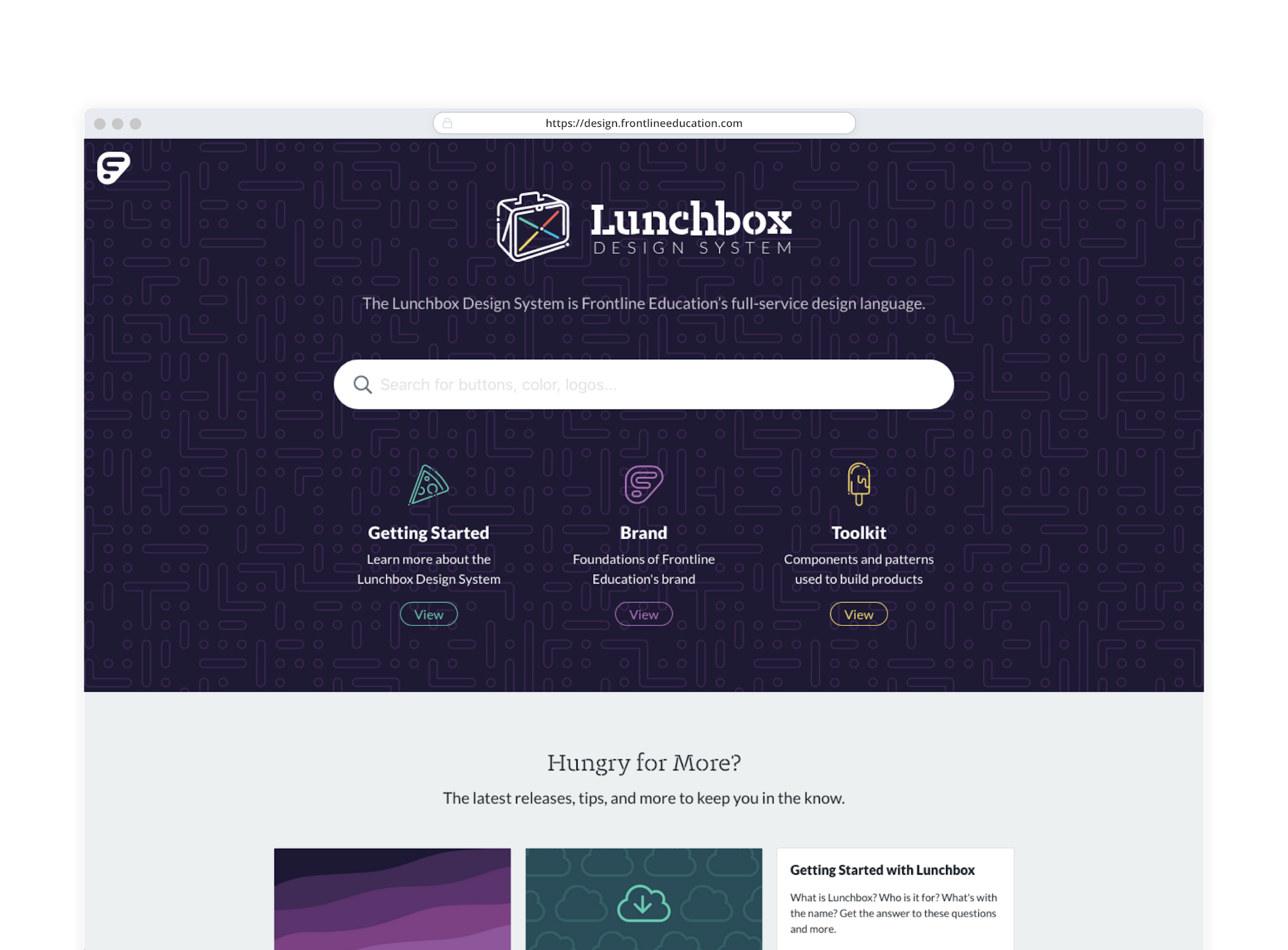
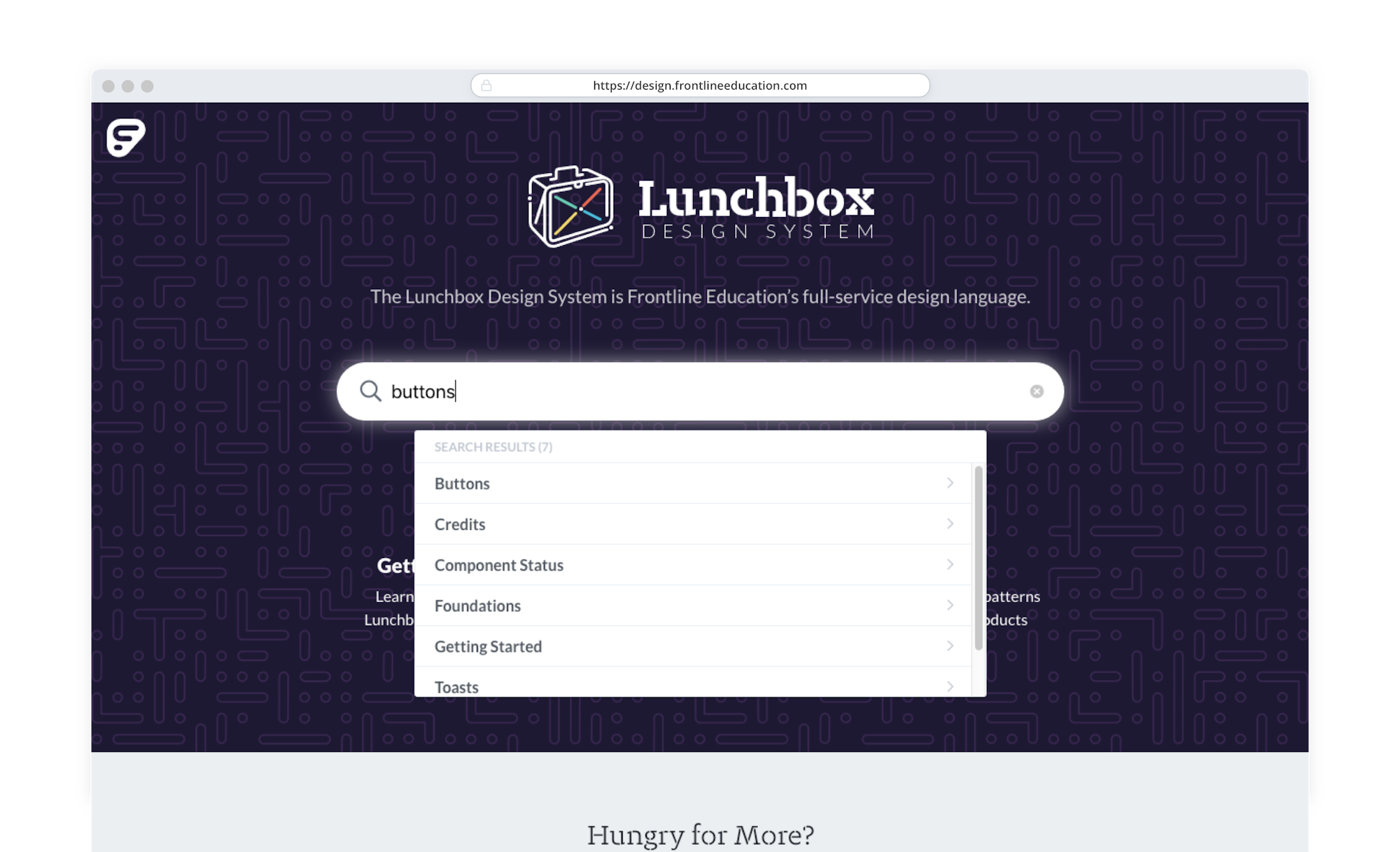
- Make the styleguide easy to access by anyone (available at design.frontlineeducation.com).
- The site must be easy to edit.
- The styleguide must unify all design principles across Frontline: marketing, product, and brand values.
This project is still very much in-progress, but already we have seen great improvements in understand what is available to use in designs and production code.
Color Guidelines
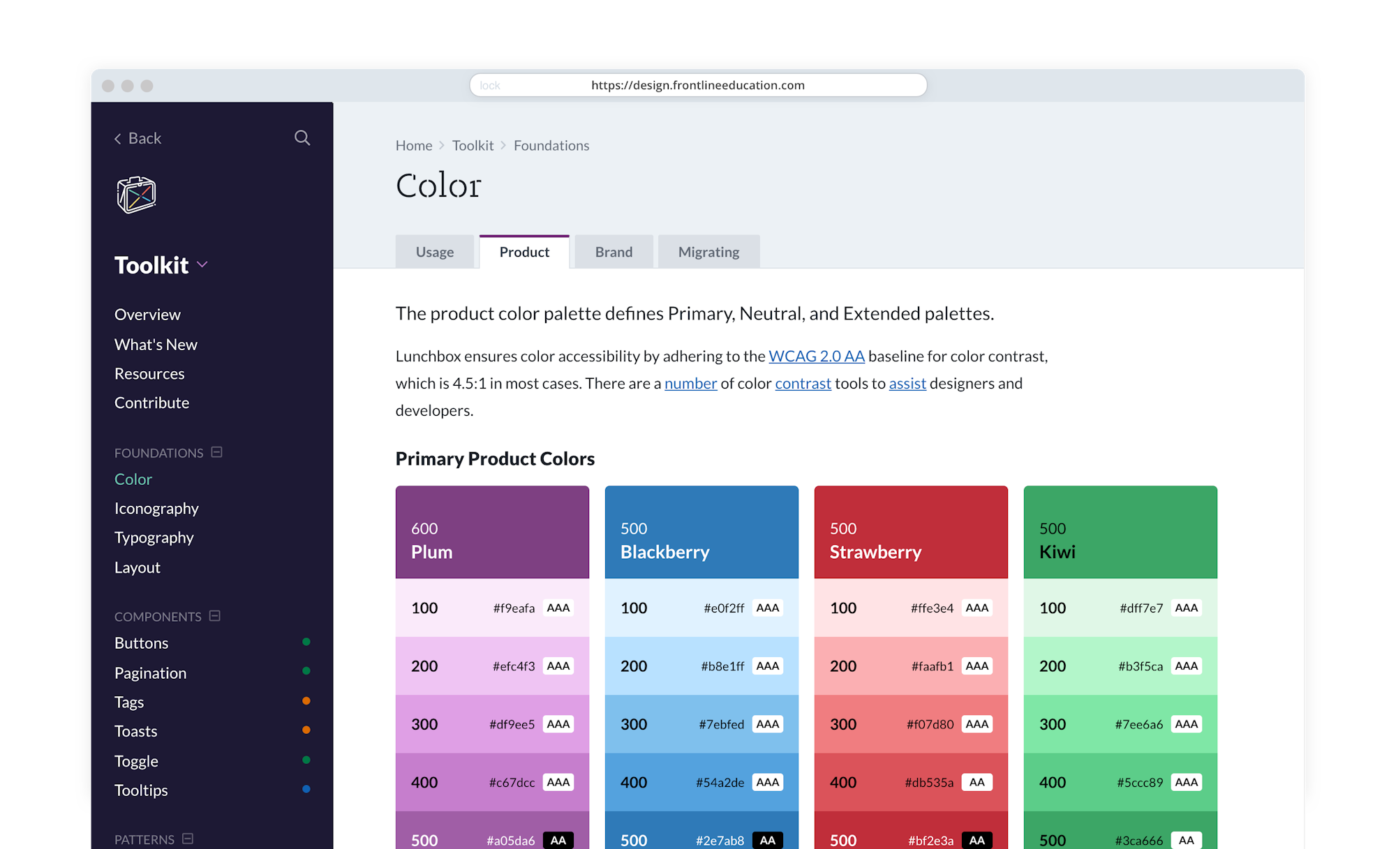
Our color guidelines have proved very helpful to both designers and developers. Each color is given 7 shades with a primary shade denoted to assist in choosing a base color. We also give quick guidance about color accessibility right on the palettes.
